About Obi Elledge

http://obi2020.com

Posts by Obi Elledge:

Content strategy in a decentralized org

Global map with team member icons on every continent

Image via Java CTO Club

About a year ago I wrote a quickstart guide on how to buy Bitcoin. What a difference a year makes! Since then, Bitcoin and the rest of the cryptocurrency market has taken us all for a rollercoaster ride. Massive losses in price from the all-time high have caused many to lose interest. Those still paying attention, however, have seen that what was lost in market cap was gained product development. What’s come into focus now is the fact that this movement is about so much more than money and the real excitment has just begun.

So after I learned how to buy Bitcoin, I learn how to trade it. And after I made a few trades, I started looking into mining. Then after reading up on mining and tinkering around with a web-based toy or two, I started thinking about how I might earn cryptocurrency, instead of buying or mining it. That’s when I went on the hunt for job in crypto. There weren’t many to match my skills, but I kept digging until I found a wonderful opportunity with Status.im.

Read more

Crypto Quick Start

If you’ve been hearing about Bitcoin and want to get involved, but don’t know how to start, use this easy guide to take your first steps into the cryptoverse.

Step 1: Understand what you’re getting into

First, know that I’m not a financial advisor and that the cryptocurrency market is very volatile. Do not invest more than you can afford to lose – especially while you’re learning the basics. I believe blockchain technology is poised to revolutionize our modern society, but it’s still in its infancy. Proceed with confident caution.

Read more

#io17 brings content strategy to center stage

UX Writer | Content Strategist | Product Writer | UI Writer | Content Designer | Editorial Manager | Software Copywriter

All of the above job titles are used to describe the person responsible for the words found in and around a web or mobile application. While the task of writing copy for user interfaces isn’t new, the consideration of it as crucial to successful product development is a fairly fresh idea. The wide variance of job titles is evidence that companies are still figuring out what it means to staff this sort of work.

Read more

Live from Mountain View: Google I/O 2016

Where’ve you been, EightyJane?
If you follow me on LinkedIn, you may know that I’ve defected from entrepreneurial life to take a position at Google. Having never (ever, ever) considered myself the “corporate type,” this move was made with some trepidation: Can I retain any sense of autonomy? Will I feel inspired by purpose or get caught in the money trap? Will my creative talents go dull?

<–more Read more!–>
Life at Google
I’m only half a year in, but I’m happy to report that culture at Google lives up to the hype and if I become a corporate drone, I’ll have only myself to blame. I was hired to be a leader of UX content strategy for SMB (small-to-medium business) audiences because of my entrepreneurial spirit, not in spite of it. Accordingly, I still have plenty of room to exercise, learn new skills, attend tech talks, and be otherwise dynamically productive during my 9ish to 5ish day.

Eye on I/O
The Google brand is been about being open and accessible so that the willing can have the resources to make the world anew. And that’s what I/O is about. It’s about sharing what’s new with the world and engaging a community of makers as partners in evolving the world of digital technology. That community isn’t just in Silicon Valley; it isn’t just in the Bay Area; and it certainly isn’t limited to the United States. It is worldwide.

So wherever you are, and whether you’re a developer, a designer, a content creator, a wannabe, or just a lover of all things tech – watch the I/O keynote live online, here on eightyjane.com, and be informed. Better yet, be inspired!

HBO NOW App still far from Netflix UX gold standard

Netflix has spoiled me. The video streaming pioneer is a sophisticated platform that makes browsing a huge catalog feel as comfortable and familiar as scanning the media shelves in my living room. That is, if my living room shelves could magically refresh themselves with new items while remaining perfectly curated to my current tastes, while being (mostly) clutter-free. The 18-year-old company has made me expect savvy streaming experiences – especially when viewing premium content.

<–more Read more!–>
So imagine my horror when I signed up for HBO NOW and discovered the user interface looking like a free WP magazine-style theme template! There doesn’t seem to be any account personalization outside of the very basic watchlist, which allows you to save items to watch later. That leaves the front page to fall back on the curation efforts that appeal to the largest common denominator… and we know what happens with that approach. Or, if you didn’t know, here it is.
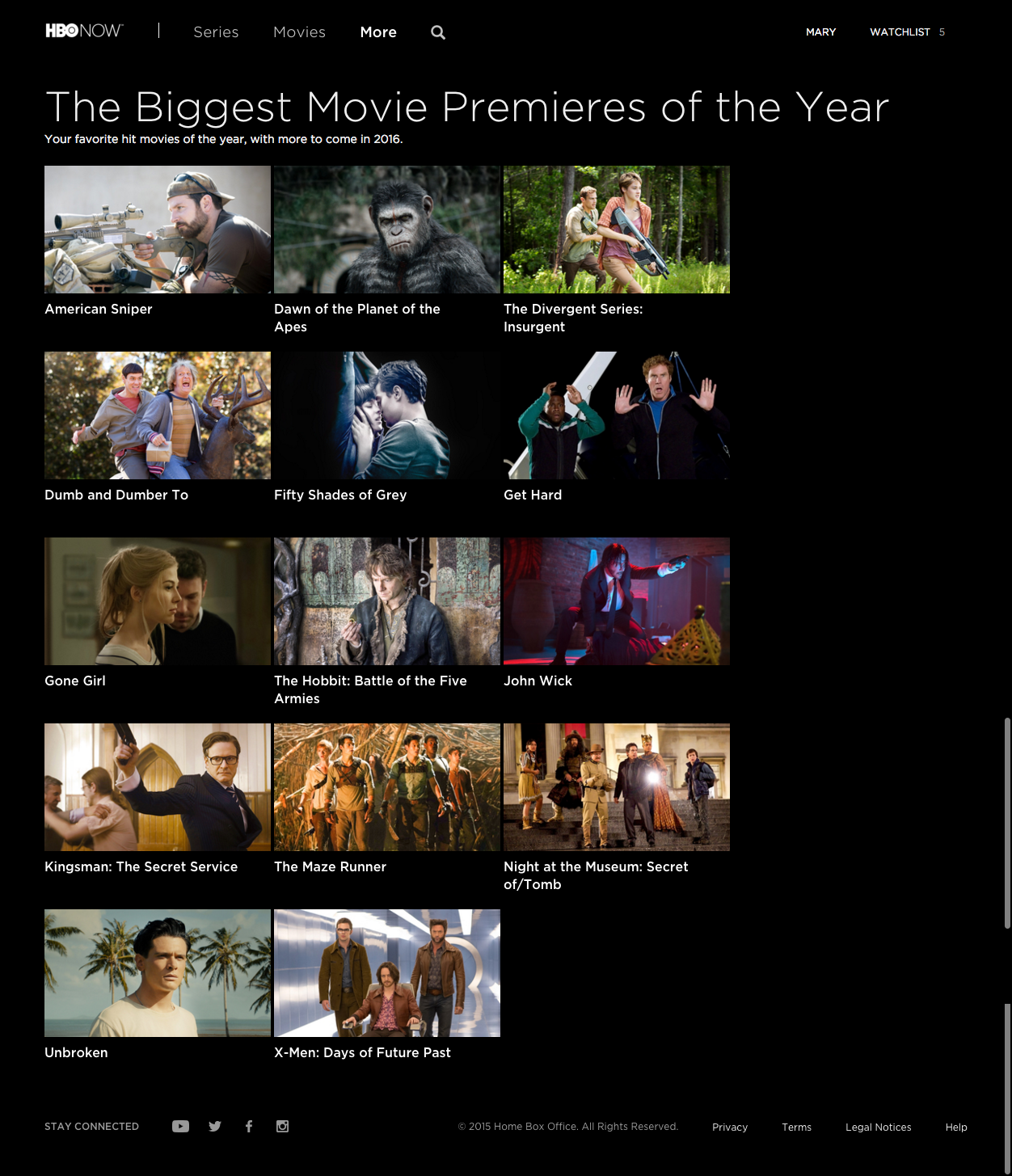
[Pictured, from HBO NOW desktop app: A collection of movie stills that all feature white males, with a few decorative guns and women in the mix. The guns outnumber the women.]

If I didn’t already know that HBO does actually have great programming, a page like this would send me directly to the subscription cancellation page in my Google Play account. Yet the network can bank on it’s huge and hugely popular catalogue of critically acclaimed shows and documentaries to make viewers like me slog through what looks like someone’s copy+paste-from-the-CMS-backend job.

HBO has finally bent to the inevitable tide of online entertainment consumption that is ringing the death knell of traditional cable services. They must have finally understood that folks like me (and I’m among a growing majority) would sooner forego the pleasure of a timely viewing of Curb Your Enthusiasm, VEEP, Getting On and so so many movies than submit to the tyranny that is a traditional cable subscription. However, they are a long way from serving on-demanding consumers who expect smart information architecture and customized content.

In the longrun – after a number of series binges – the poor navigation and lack of dynamic discovery in the app will make the offering much less attractive to me. Especially at it’s premium $14.99 per month price. Further, Netflix is quickly catching up in the original programming game. To remain competitive HBO will really have to push to develop it’s applications to the golden user experience standard customers now expect.

App of the Week: Canva helps busy bloggers look good

mary must blog

I’ve recently had the privilege of working on content management and publishing for the world’s largest retailer. The opportunity to be a part of the digital strategy team for an organization of such scale has been thrilling, but it’s required some sacrifices. My aversion to cubicles notwithstanding, I can be counted on to be in the office 40+ hours per week and, woefully, in the car 15+ hours per week (#commuterprobs). It could be worse, but it has put an near freeze on all of my blogging activities. A fact that’s made my inner entrepreneur restless and demanding: I must blog.

<–more Read more!–>
With spare time short, blogging has to be quick and efficient without sacrificing my digital content values: quality copy and visual excellency. Thats where apps like Canva become a blogger’s salvation. The web application allows non-designers to pull together tasty graphics that please the modern media consumer’s palette. Using templates and simple drag & drop actions members can create slick looking presentations, social media images, flyers, and blog graphics, among an impressive number of formats. The company’s recent move to open the pool of layouts to contributing designers should make options even richer, granted they maintain high design standards and keep navigation and browsing easy.

The Canva user interface is very intuitive, but to get you started and keep you going, members learn to use the platform using the app’s design school. Think Codecademy meets Polyvore. And it’s free! Freemium, that is, as it’s got a useful basic service that is free of charge, but premium features can be purchased to enhance your experience of the product. For example, the graphic above contains a watermark because the background image is a premium image. Just $1 to remove that and obtain a one time use license.

I used a free template to create the graphic below and it’s one of many that are good candidates for periodic posts. From pretty images & pithy sayings to decorate an Intagram feed, to quarterly reports turned into an infographic, Canva helps the helpless add polish to their digital repertoire. That makes it well-qualified to be the app of the week.

canva app of the week

Collector’s Paradise: eBay Joins the Content Curation Party

ebay collections as content strategy

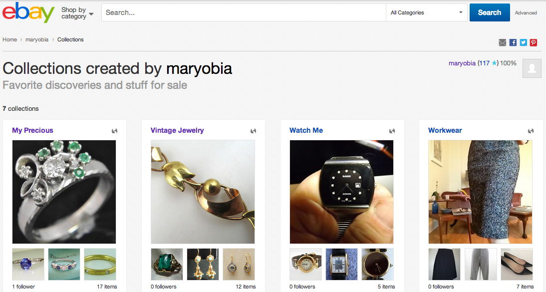
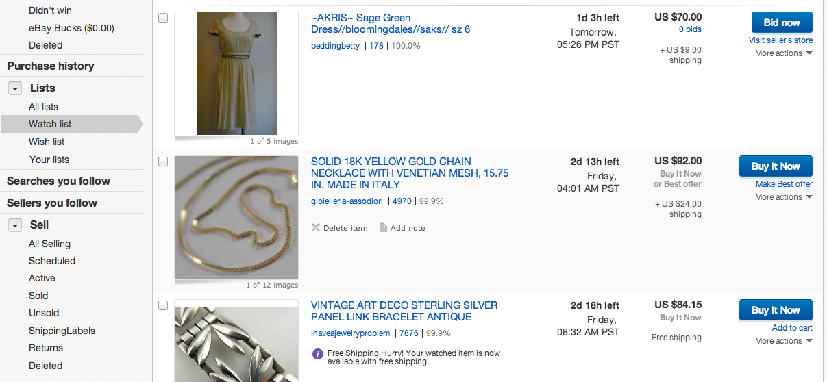
When eBay introduced collections a few months ago I wondered if they were a replacement for their not-so-slick lists. Themselves a fairly new extension of the veteran Watch List, lists were a way to categorize all those things you “watch” – often with no real intention to buy. They encourage the rampant window shopping that, if other members are like me, makes up the vast majority of time spent on eBay. Unfortunately, lists don’t have a sexy* user interface and are buried under vague navigation clicks. The result is they’re forgotten just as quickly as they’re made.

ebay lists and navigation
More

#FTW14: Mobile Apps for Offline Shopping

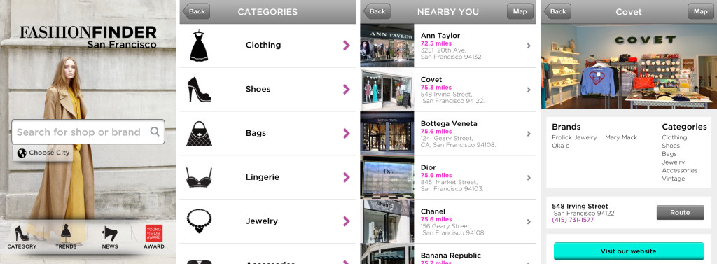
The Retail Tech Summit took place Sunday, March 2nd, as part of San Francisco’s Fashion Tech Week 2014. The event featured presentations and panel discussions from companies that are using technology in new ways to improve retail experiences online and offline. Surprisingly, though, this years selection of presenters skewed toward the offline end of the spectrum. It was a refreshing break from the barage of e-commerce options that dominate the fashion app landscape. I was especially intrigued that among a short list, there were two applications at the summit focus on helping mobile users find brick and mortar shops to patronize.

click for larger view

click for larger view

More

Diary of a Digital Stylist: Covet Fashion App

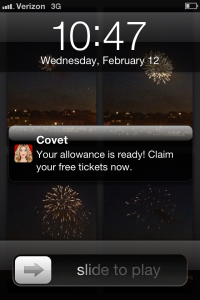
covet allowance notification I’ve been a fan of online dress up games since before they were made for anyone older than about 8 years. Thankfully, the fast-growing fashion e-commerce industry has made developing such games for adults more worthwhile. My lastest digital styling obsession is Covet Fashion app, from Burlingame-based game firm, CrowdStar.

The iPhone note you see here is one I look forward to daily, because it means I have more gameplay ammo. For those that like to create outfits using digital tools the game is very engaging. It’s a great mix between games where you dress up digital “dolls” and sites like Polyvore.com, which feature real clothes, but no bodies to put them on.

covet fashion app enter events

The object of the Covet Fashion game is to enter events which require you to create looks for a specific occasion. If your look is highly rated by the community you win a piece of fashion to add to your virtual wardrobe. Access to events is limited by either the value of your closet or the necessity to use a certain brand in your look. Some brand-sponsored events feature a real prize for the top-rated look, as judged by the community and the Covet Fashion team. More